Creative Intuition: Yacht Vesper
SEAHORSE
While modern sailmaking is a product of highly sophisticated, computer-assisted science, it has long been acknowledged that part of the magic still resides with the sailmaker’s intuitive understanding of how to use these tools to best effect—the artist’s touch. A recent collaboration between Doyle Sails and the internationally renowned painter Susan Swartz highlighted a case where modern science and technology are able to turn sails into an artist’s canvas—with no compromise in performance.
The project began after Jim and Susan Swartz acquired the highly successful Judel/Vrolijk Maxi 72. Momo, following its stellar run with five class victories in 2018 which included a successful defense of its Maxi World title.
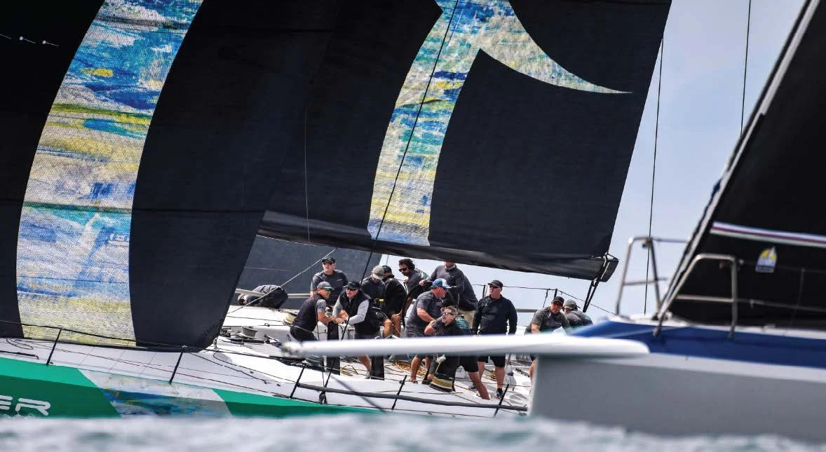
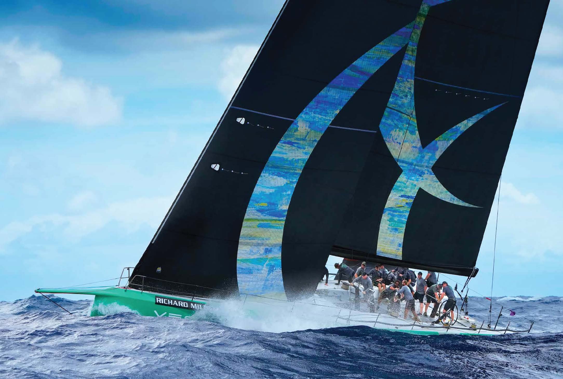
Renamed Vesper in keeping with a James Bond theme that has applied to previous Swartz yachts, the yacht has continued to perform well under Jim Swartz’s command including runner-up finishes at the 2019 and 2021 Maxi Worlds, and a convincing win at this year’s Les Voiles de St Barth regatta in April. During the Swartz ownership, Vesper has undergone a steady program of upgrades including new Doyle sails which made their debut at St Barth’s. As part of that process, Jim Swartz has been able to bring his wife’s redoubtable artistic talents on board in the form of striking wave-like graphics that cover the sailplan and extend down and across the hull as well.
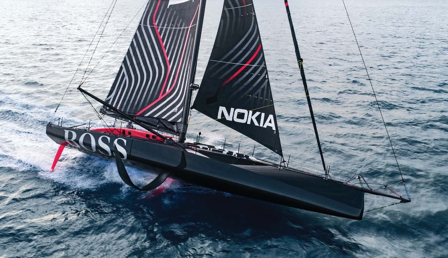
For the sails, the project provided a unique test of Doyle Sails’ well-proven Stratis SailArt technology which produces photo quality images with extremely sharp detailing. “We have been able to offer this to our customers for a few years now,” says Doyle Sails CEO Mike Sanderson. “If you think of the graphics on Hugo Boss in the last Vendée Globe, or American Magic at the America’s Cup, they were done in this way. All the SailGP sail graphics are done with SailArt as well.”
The Process involves the selected graphics or images being printed onto the outer surfaces of the sail with a giant printer using sustainable, non-toxic, and highly durable inks. “We have more than a dozen outside surfaces and can print on any sails, from superyacht specification to grand prix specification with zero compromise to the sail’s performance. It is the same product, whether it is printed or not,” says Sanderson. “The sail is designed for performance and then, during our nesting process, the printed surface layers are laid down as part of the lamination process and then cured under heat and pressure.”
The artwork being integrated into the actual construction process gives it a translucent quality, not available in the conventional system of externally applying the graphics afterwards. “It makes the graphics much more pronounced and dramatic,” says Sanderson.
In the normal course of events, yacht graphics generally use bold, solid colors supporting company logos to provide eye-catching floating sponsor billboards that will attract eyeballs and TV lenses. The challenge with a work of art is that every brush stroke is freighted with intent and every subtle shift in tone or color carries significance.
Susan Swartz’s paintings have graced exhibitions all over the world. She is celebrated particularly for her depictions of nature. “She goes behind nature, behind the act of painting and into the spiritual realm,” wrote critic Melik Kaylan, while curator Silke Hohmann noted of Swart’s work: “Nature remains a constant, but emerges ever more clearly in the latest pieces: one could even say in a joyful, playful way.” There is also an element of activism behind her work. “I am an environmental artist and my love of nature is inherent in every brush stroke,” she says. “I paint to express and capture the beauty of nature in order to move and inspire people to preserve it. If I can reach people on a visceral level through my expressions on the canvas, we can share a commitment to protect the marvels of the natural world for future generations.”
For the Vesper project, she used an existing painting called Summer Bliss which had toured as part of her solo exhibitions all over the world including at the Central Academy of Fine Arts (CAFA) in Beijing, the Ludwig Museum of Contemporary Art in Budapest, the State Russian Museum in St. Petersburg, and Gallery Noack in Berlin. After an exhibition in Lisbon, the painting was withdrawn to be devoted to the Vesper design.
She adds: “Summer Bliss was inspired by seaside summers and thus could not be a better fit. It was definitely the one for this exciting project.”
Graphic artist Bill MacGowan of Mac Design in Newport, Rhode Island was called upon to assist in a “truly unique and creative collaboration” with Swartz and Doyle Sails to achieve the final result. A sailor himself, MacGowan has worked on many marine projects including pervious Swartz yachts, Moneypenny and an earlier Vesper.
The current Vesper look involves energetic swirls, perhaps suggestive of waves rising from the sea up across the hull and continuing up the sails, with striations of subtle, multi-hued detail from the Summer Bliss painting filling the shapes. The hull graphics were printed separately on vinyl coatings and then clear-coated for protection.
Achieving the finished product across a variety of materials and disciplines demanded close communication and cooperation. “Effective communication among all parties was key and crucial to its success,” Swartz agrees. “We all knew that we were working on something special together.”
Swartz and her husband are also both founder members of Impact Partners, an Oscar and Emmy award-winning documentary production group working for change on pressing social and environmental issues. As the Vesper project was going to be a dynamic, kinetic piece of art, one wondered if a cinematic, movie-maker’s sensibility might have been called forth to action.
“I always push myself to try something that has never been done before,” Swartz replies. “I am technically trained in realism painting and could spatially imagine the form. But this project also required thinking three-dimensionally and energetically in the abstract sense. I challenged myself to imagine how color striations and sight lines would mix with the motion of bounding through the ocean at high speeds… exploding with color and drama. When I first saw Vesper sailing in this new form, I was truly awestruck and quite literally speechless. It brought tears to my eyes… The open ocean is by far my most compelling artistic partner to date and the sailboat my most unique medium. It takes my breath away to think about it.”
Even for Sanderson, the outcome has been a revelation, “I was actually a bit skeptical about how the boat would look but on the water when the sun is behind the sails it lights up like a lantern. It is very striking. This project certainly showcases the accuracy of our process. It is a great thing to be able to do.
With performance always front of mind, Sanderson adds that another huge benefit is that SailArt graphics only add seven grammes of weight for every square meter applied, compared with about 35 gm/m2 for conventional systems. He recalls endless arguments during the 2003 America’s Cup with sponsors demanding massive logos on sails that were going to add significant weight. “Now we can say to any sponsor or client, “Go for it—do whatever you want.”
At the St Barth’s regatta in April, where Vesper’s new livery was on show, Sanderson was delighted with the inroads the Doyle Sails brand is making in the Maxi 72 fleet. “At the next worlds we will have Cannonball, Vesper, Proteus, and Bella Mente all racing with Doyle Sails,” he notes.
During the racing, Sanderson helmed Bella Mente in owner Hap Fauth’s absence. In the heat of battle he had plenty of opportunity to admire Vesper’s new sails but he would have preferred to have been looking over his shoulder rather than peering ahead to do so. “To be honest, Vesper gave us a good pasting,” he admits ruefully.
At one point, Bella Mente tactician Terry Hutchinson urged Sanderson to hold pace and line with Vesper as they approached a turning mark. “I am struggling to hold up with them,” replied Sanderson. “Well,” snorted an exasperated Hutchinson, “it’s your fault for selling them those sails.” “It wasn’t me, it was Duffy,” protested Sanderson in reference to fellow Doyle Sails director David Duff, who handled the Vesper project.
The science side of sailmaking would vigorously insist that no graphics, however inspired or beautiful, could make any boat go faster. But the evidence of Vesper’s convincing win at St Barth’s would surely convince the most rigorous of scientists that the graphics were certainly not slowing her down.
Susan sailing on Vesper for the first time.
Summer Bliss, Acrylic on linen, 72x48” 2014.


